

KEY-VISUAL
2023
TOLLWOOD 2024
During my internship at the Studio «Joseph & Sebastian» in Munich I was able to create a proposal for the key-visual of the Tollwood Winterfestival 2024. The variety of activities and art forms that are represented at the festival every year were the main inspiration for the characters and colours in the design. Additionally it was created to attract a wide variety of people, work as a responsive design in all different formats necessary and incorporate the magical and whimsical energy of the festive season.


EVENT DESIGN
2024
NACHT DER BIBLIOTHEKEN
In our current age of technology, libraries have lost a lot of the importance they once had. The purpose of this event is to encourage individuals to return to libraries, particularly the younger generations, who may not have established a connection to this once significant cultural hub. This corporate design was created for this fictional event as part of my final project in my graphic design studies at the «Schule für Gestaltung Biel».


A3 RISOPRINT
POSTERSERIES
2020
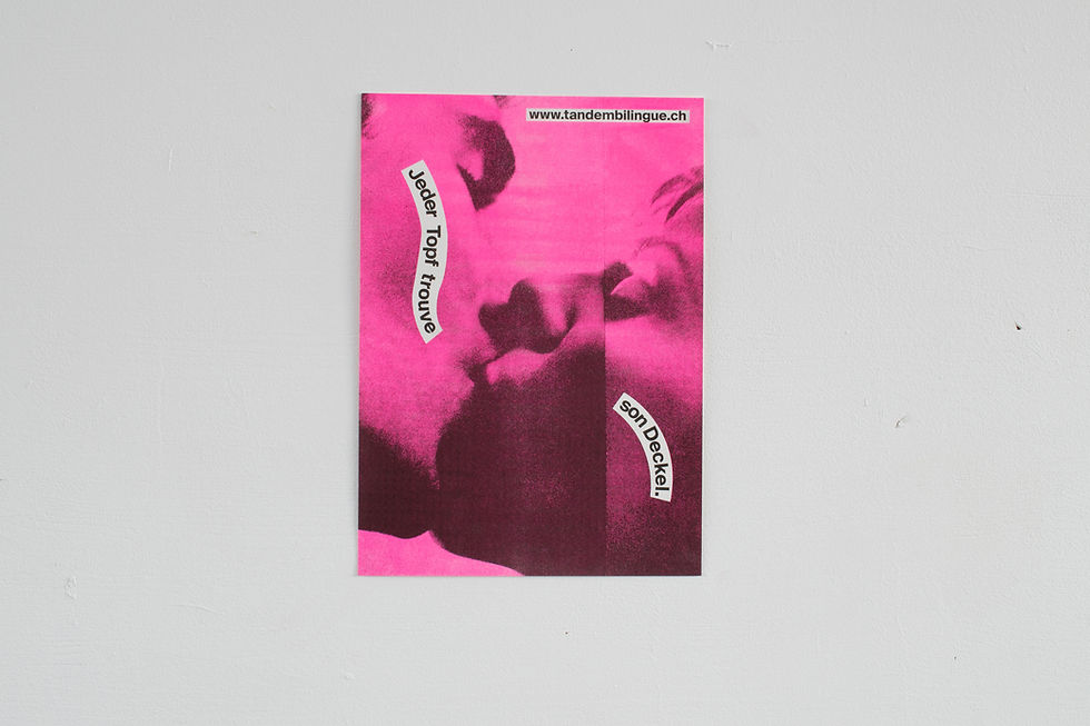
TANDEM BILINGUE
When you grow up bilingual, you often mix languages and create new constellations of sentences and meanings. Playing with German proverbs by replacing some words with French words was the concept of this poster series. The aim was to show the mixing of languages that bilingual people grow up with. On the posters, the typography blends with the elements in the photos, thus creating a unified image.


20 x 26CM BOOK (HANDBOUND)
2022
INNER LIFE
I know me, do you know you?
Addressing trauma and personal thoughts through text and illustration were the main theme of this project. Handwritten texts were set with illustrations done in ink and gouache on A3. Everything was then printed and bound by hand, producing 6 copies. A mural of one of the illustrations was made for the subsequent exhibition.


CORPORATE
IDENTITY
2022
ECMC 2024
Speed, accessibility and versatility are the terms that the «European Cycling Messenger Championship» embodies. For the CI, the goal was to work only with typography and thus create a striking design. In addition, the design should be applicable to many different formats and in a further step be converted into a website.


A5 BOOKLET
2021
STILÜBUNGEN
How do I stage typography? Experimenting with typography and dynamics was the central theme of this project. Using the same text as a template, one typeface and four keywords, 17 different solutions were found with which typography can be presented in an exciting way. These designs were then compiled and bound in an A5 booklet.


ANIMATION
2021
MAGNUS ARCHIVES
«The Magnus Archives» is a weekly horror fiction anthology podcast examining the mysteries within the archives of the London based «Magnus Institute», an organization dedicated to documenting and researching the esoteric and the weird. But what if this podcast had a title sequence? For this animation, all the illustrations were hand-drawn and put together to create coherent transitions between the fears that feature in the story. (The Animation)